VLE Redesign
Timeline
September 2020 – December 2020
Role
UX Designer with a focus on usability testing
Stakeholder
Kingston University
Tools
Adobe Xd
Context
Canvas is an industry-leading web-based virtual learning environment (VLE), and the overall user experience is crucial for keeping this leading position.
There are several different kinds of user groups, starting from students of Generation Z who are confident in the technology to teachers who are still having difficulties with computers. These core users interact with Canvas every day, and their overall satisfaction is the key.
/project aim
The purpose of this project was to identify usability problems of Canvas by analysing qualitative and quantitative data collected during the usability testing sessions and to use these results for enhancing the user experience of Canvas.
Usability Tests
/remote testing
The national lockdowns required some flexibility, so I conducted the usability tests remotely on Microsoft Teams to not delay the project.
/target groups
I narrowed down the user profiles to ensure we represent the two main target groups:
- Target Group L: Lecturers
- Target Group S: Students
/usability test tasks
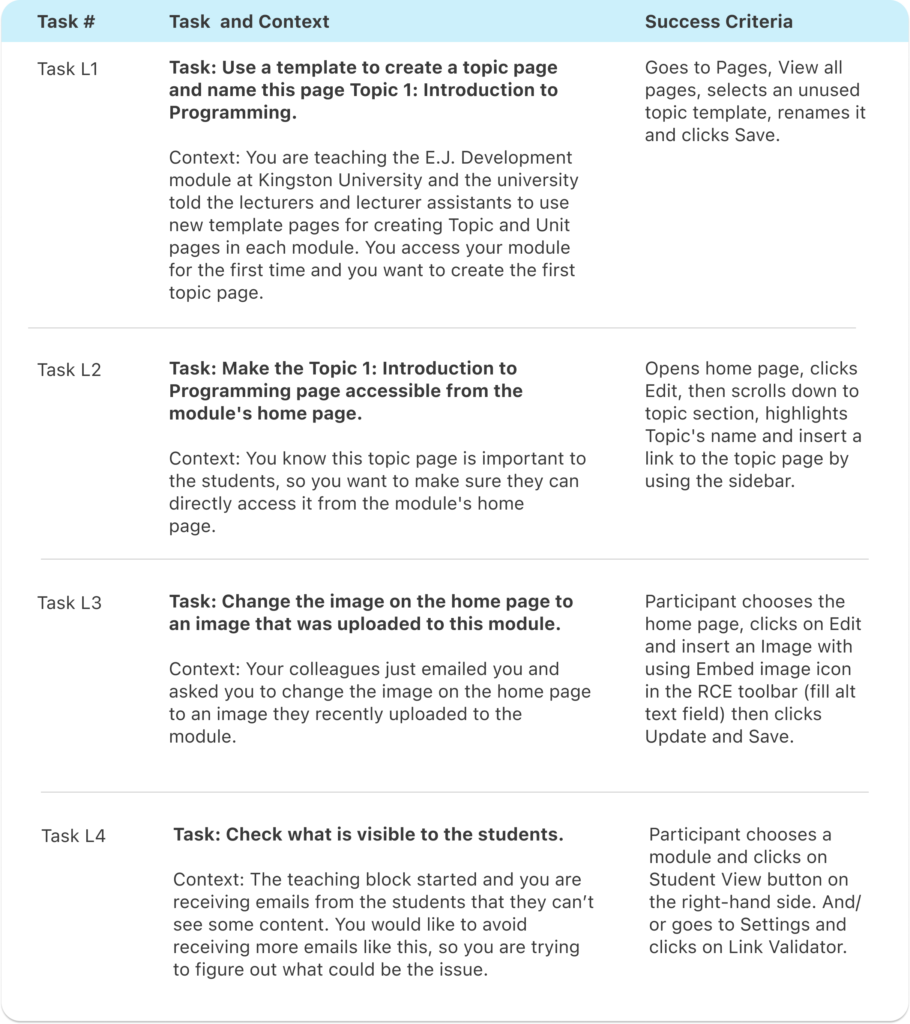
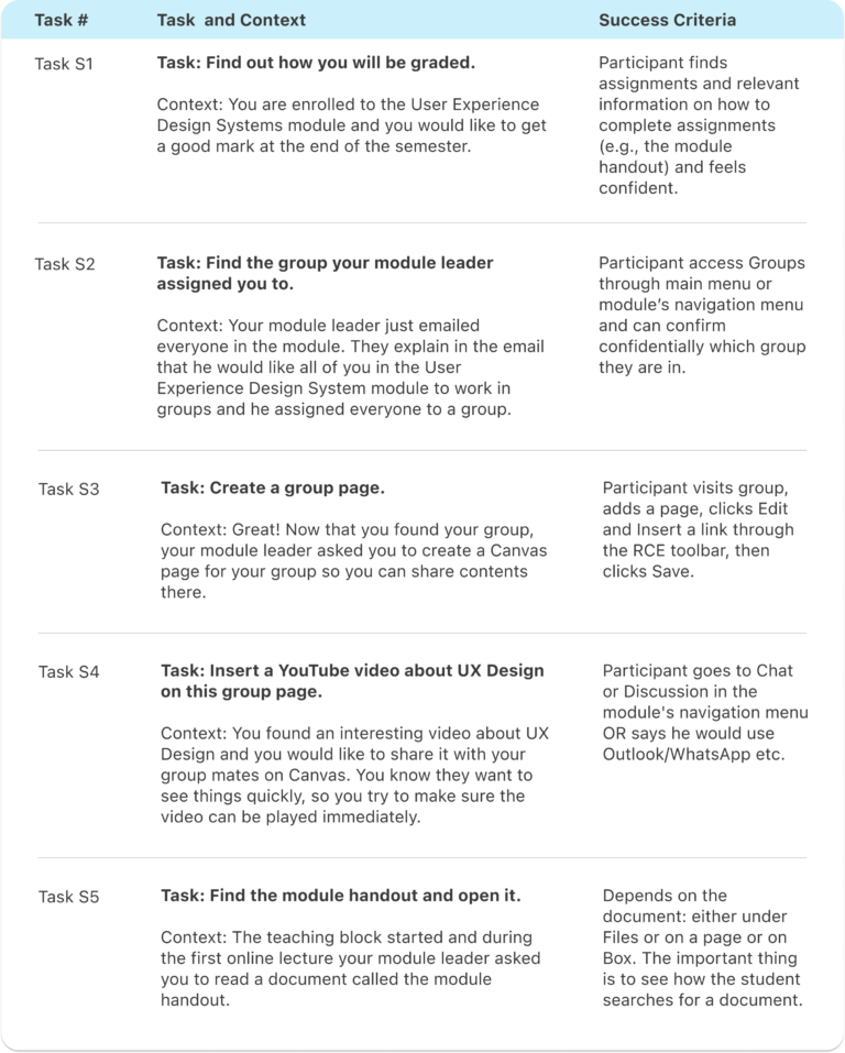
As I have been a student and working closely with staff members on Canvas, I could observe them and create a task list accordingly. First, I listed the main goals of both target groups, then I collected the actions they would complete in real life to achieve these goals.
I designed all tasks to be closed-ended, meaning they were goal-oriented, and in most cases, there was only one correct way to achieve them.
/metrics
I measured in total 9 metrics (KPIs) to analyze both the objective user data and subjective user reviews. These are the KPIs I used:
- Performance Metrics
- Task Success and Reliability
- Time On Task
- Errors and Assists
- Efficiency
- Issue-Based Metric
- Issues by Task
- Issues by Category
- Self-Reported Metrics
- Post-Task Rating
- Open-Ended Questions
- Usability Metric for User Experience (UMUX)
Results
/task analysis
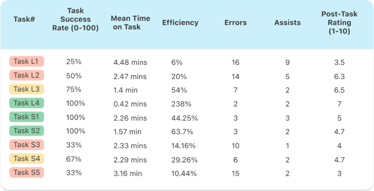
The task analysis found evidence for redesigning the page creation process with the highest Mean Time on Task (4.48 minutes), the lowest Efficiency (6%) and Post-Task Rating (3.5). From the results, it is also clear that the template page system is inefficient (Task Success Rate 50%), and users spend considerable time completing it, resulting in a 20% Efficiency.
When looking at the results of the tasks of Target Group S, creating a group page and finding the module handout resulted in the highest number of errors, in total 10 and 15 respectively. As for Task Efficiency, accessing the handout document has the lowest rate with 10.14%.
/UMUX scores
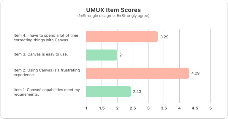
Both positive statements, namely Item 1 and Item 3, received a low score. This confirms that Canvas has usability issues crucially affecting the product’s effectiveness (Mean item 1 score= 2.43) and efficiency (Mean Item 3 score= 2).
Participants strongly agreed that using Canvas is frustrating (Mean Item 2 Score=4.29) but they were less critical about the time they had to spend on Canvas (Mean Item 4 score=3.29).
Redesign
/usability issues and recommendations
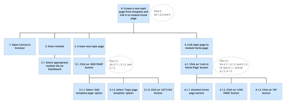
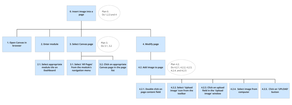
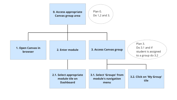
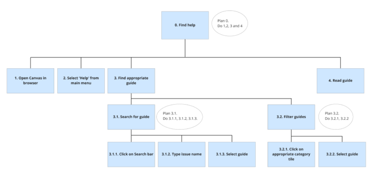
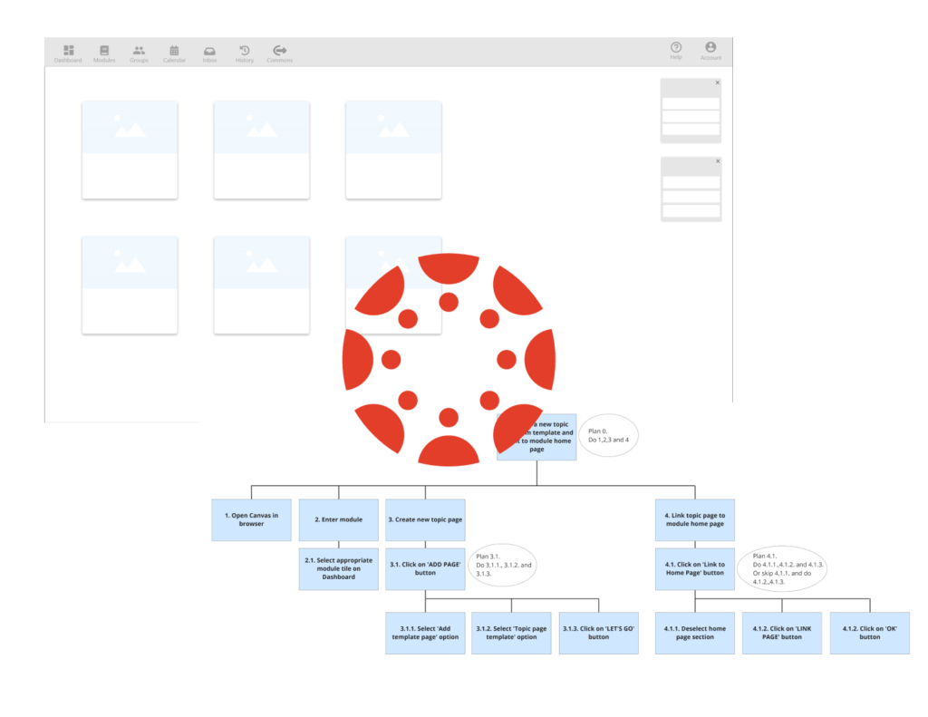
Below I listed the key issues and recommendations on how to fix them. I added HTA diagrams as well to support these design ideas.
Issue A: Creating Pages and Using Template System
Successful page creation requires practice and repetition and even for experts, it is not time-efficient with a 6% Efficiency rate.
Recommendations:
- Add a +Page button to the homepage’s top right corner.
- When the user clicks on Pages in the module/ module group navigation menu, they should see the list of Pages immediately and the +Page button in the top right corner.
- When user clicks on the +Page button, the system offers two options, create a blank page or create a page by using a template.
Issue B: Editing Pages
Editing a page includes a significant amount of unnecessary scrolling and users clearly do not find and use the Edit button intuitively.
Recommendations:
- Mimic the functionality of website builder products, for example Wix or WordPress, and let the user edit the page by double-clicking on the desired page section.
- Make Edit button a fixed floating action button that follows the movements of the users, thus preventing unnecessary scrolling.
- Add a button to each page that allows the user to link the page to a chosen page.
- Add a Search bar to the Text Editor’s sidebar.
Issue C: Completing the module
All participants of Target Group S expressed their desire to have every content on one page, including the assignments, the rubrics and the module handout, without having to leave Canvas (e.g. Box).
Recommendations:
- Choose the right wording and create one link in the module navigation menu that focuses on summarising what the student need to do to complete the module, listing all the module assignments (grading, rubrics, description) and the module handout.
Issue D: Canvas Groups
None of the participants of Target Group S were able to find Groups easily, due to the absence of the word ‘groups’ in the module’s navigation menu or among the main links on the module homepage.
Recommendations:
- Add Groups link to the module navigation menu. Keep People menu, but only to show the list of people in the module.
- When students click on Groups menu, their groups are visually distinguished from the other groups and placed at the top of the page.
- When students click Visit to see the mini module dedicated to their group, the Home menu shows the actual homepage, and the activities in the group on the right hand side.
Issue E: Navigation
Nearly 86% of the participants felt lost on Canvas at least once during the sessions and were not able to repeat the steps they just completed.
Recommendations:
- Distinguish the main menu and the module navigation menu by using horizontal navigation for one and vertical navigation for the other one.
- Rethink system colours and create higher colour contrasts.

